

You shipped the product, watched signups arrive, and opened a dashboard full of green arrows. Then a customer asked the question nobody had settled: “Is this working?” Traffic looked healthy, yet few users reached the core action. Support tickets hinted at friction. Revenue hadn't arrived. Your team had activity, but no shared definition of success.
That's the founder problem behind how to measure product success. You don't need a wall of charts. You need a small measurement system that connects user behavior to the value your product promises, then connects that value to business health.
What Measuring Product Success Really Means
Product success starts after launch. A release can attract attention and still fail to help users complete the job they hired your product to do. I treat success as a portfolio, much like a three-legged stool. Sentiment tells you how users feel, usage tells you what they do, and revenue tells you whether the product creates economic value.
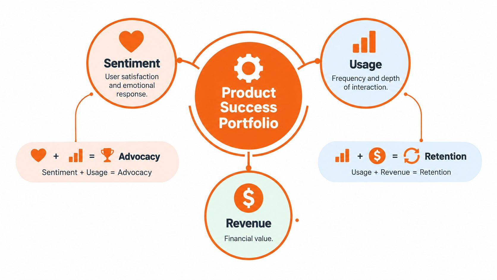
A founder might celebrate thousands of visits to a new landing page. That number says people arrived. It doesn't tell you whether they understood the offer, completed the first useful action, returned later, or paid. A signup count has the same weakness. It measures an event at the door, not value inside the room.
A 2026 industry survey found that 38.1% of respondents use customer satisfaction measures such as CSAT or NPS to measure product success. The same survey found that 34.4% use active usage, 29.1% use revenue influenced by product improvements, 28.7% use workflow or feature adoption, and 26.2% use retention or churn, as reported in the Product-Led Alliance product management statistics survey. That spread matters because teams usually need several views of success, not one magic number.
A practical definition
I define product success this way:
A product succeeds when the right users repeatedly reach the intended outcome, feel enough confidence to continue, and create sustainable business value.
Each part earns its place:
- Right users: A feature can look weak across all accounts while working well for the segment that needs it.
- Repeatedly reach: A first-use event can indicate curiosity. Repeat behavior can indicate usefulness.
- Intended outcome: Clicking a button isn't the same as finishing the job.
- Enough confidence: Satisfaction helps explain whether users trust the experience.
- Sustainable value: Revenue and retention test whether the product can support the business.
At an early stage, you may lack reliable revenue data. You can still measure whether users reach value, return, and adopt the workflow that your product promises. A useful revenue and retention reference is this client success metrics guide from ViralRef, especially when you need to connect product behavior with customer health.
Run one quick test before adding a metric to your dashboard. Ask, “If this number moved next week, what decision would I make?” If you have no answer, you're probably tracking activity rather than value.
Define Your Goal and Pick a North Star You Can Act On
Start with the product job, not the analytics tool. Write one sentence: “Users choose this product to ______.” Then name the observable action that proves they made progress.
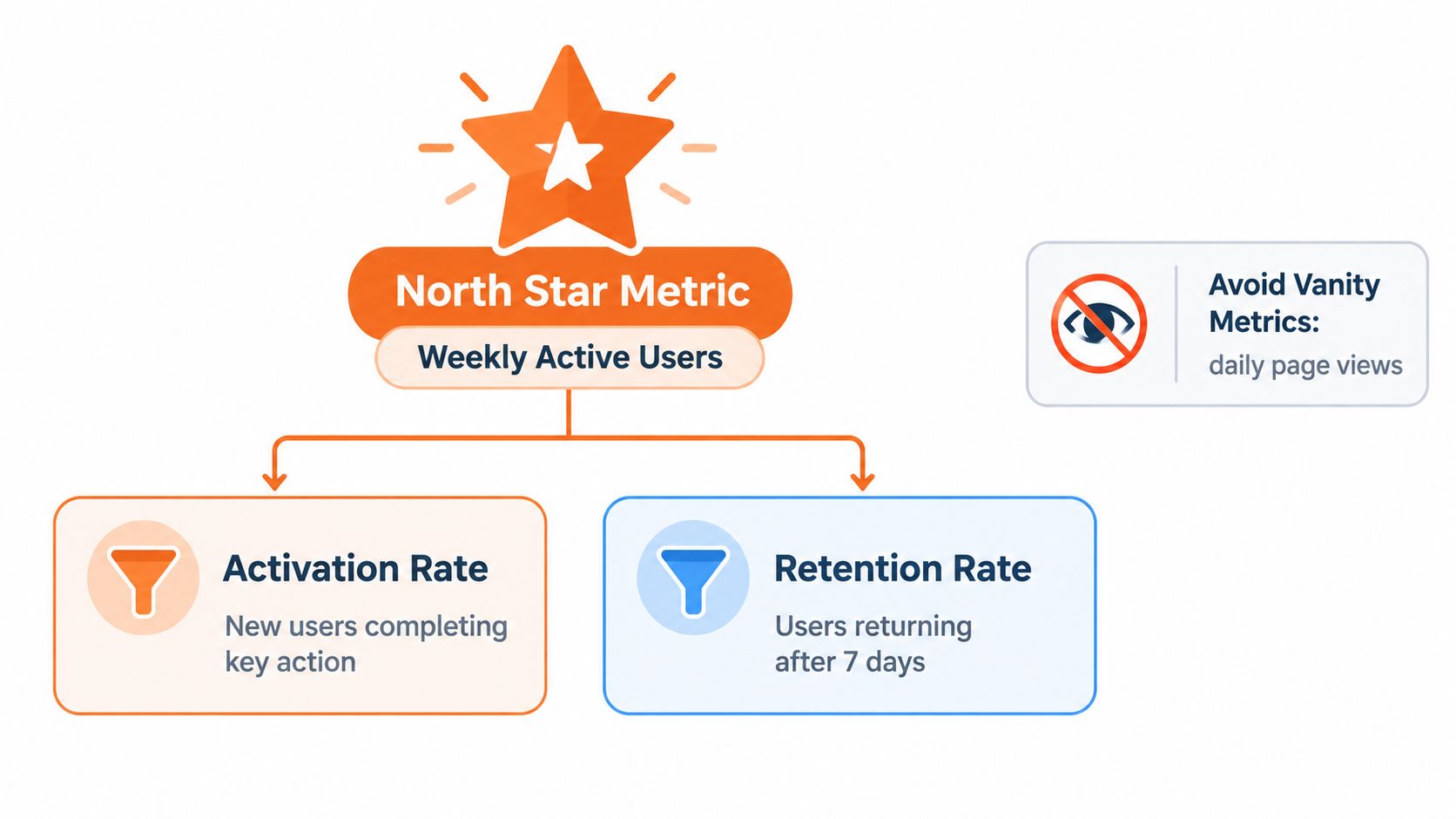
A social product might use active users because interaction is the product. A workflow tool might use completed projects, processed documents, or successful use of its main feature. The exact measure depends on the product. The rule stays consistent: choose a metric that mirrors real product usage, not attention around the product. This approach follows the recommendation to use one top-line product metric and break it into goals and supporting measures, rather than letting vanity metrics run the company, as described in this guide to product success metrics and goals.
Pick one useful top line
Use this filter:
- Does the metric represent the core customer outcome? Weekly active users make sense for a community. Completed reconciliations make more sense for accounting software.
- Can your team influence it? A metric that only changes because of market conditions won't guide product decisions.
- Can you measure it consistently? Define the event, user, time window, and inclusion rules before you publish the number.
- Does it connect to business health? Your North Star doesn't need to equal revenue, but it should have a credible path to retention, expansion, or conversion.
Avoid using page views, downloads, or raw signups as the North Star when they stop before the user receives value. These numbers can help diagnose acquisition, but they rarely deserve the top position.
Build a simple metric tree
Suppose your North Star is “weekly users who complete a core workflow.” Break it into smaller questions:
- Acquisition: Did the right people arrive?
- Activation: Did new users reach the first useful outcome?
- Engagement: Did they complete the workflow enough to gain value?
- Retention: Did they return and complete it again?
- Business result: Did successful usage support conversion, expansion, or lower churn?
Separate leading indicators from lagging indicators. Activation, adoption velocity, and early repeat usage can give you an earlier read. Revenue, retention, and churn often take longer to move. You need both. Leading indicators tell you where to investigate. Lagging indicators tell you whether the product ultimately earned its keep.
A founder-friendly dashboard can show one North Star, two supporting goals, and a handful of diagnostic measures. If you need help linking product measures to commercial outcomes, SourceLoop's guide on how to track KPIs and connect to revenue provides useful context for building that bridge.
Write the tree in plain language so anyone on the team can explain it in one minute. If your metric needs a long defense, it probably doesn't describe the product clearly enough.
Choose the Right KPIs for Pre Revenue and Post Revenue Stages
Your KPI stack should change as your evidence improves. Before revenue, you need proof that users can reach value and repeat the behavior. After revenue, you need to connect that behavior to customer retention and business economics.
The AARRR framework gives you a simple funnel map: Acquisition, Activation, Retention, Revenue, and Referral. It helps you ask whether people find you, try you, keep using you, pay you, and tell others about you, as explained in this AARRR product-led growth metrics guide.
Starter KPI Stack by Stage
| Stage | Primary Focus | Example KPIs | When to Use |
|---|---|---|---|
| Pre-revenue | First value and repeat behavior | Activation, time to value, core-feature adoption, workflow completion, early retention | Use while you're testing whether users receive a clear benefit |
| Early revenue | Paid usage and customer health | Activation, retained usage, account adoption, conversion, support friction, customer satisfaction | Use once customers pay and you can connect behavior with account status |
| Post-revenue | Durable economics | Retention, churn, expansion, revenue influenced by product improvements, referral, satisfaction | Use when you have enough customer history to study commercial outcomes |
Pre-revenue teams often overfocus on acquisition because it feels measurable. A growing waitlist can hide a weak onboarding path. Put more attention on the first action that proves the user understood the product.
Post-revenue teams face the opposite risk. They can watch monthly revenue while missing a slow decline in usage among important accounts. Keep product-level and business-level measures distinct. Retention, time to value, and adoption describe product health. CAC, churn, and NPS describe wider business or customer outcomes. You need the connection, but you shouldn't treat them as interchangeable.
Keep each KPI actionable
A useful KPI has an owner, a decision, and a review rhythm. For example:
- If activation falls, the product owner reviews onboarding and the first workflow.
- If retained usage falls for one cohort, the team checks product changes and customer interviews.
- If expansion follows adoption of a specific capability, sales and product agree on how to interpret the relationship.
Founders in the early stages can use this guide for early-stage companies as a wider reference for choosing business and product measures without building a giant reporting system.
Don't add a metric because another startup uses it. Add it because your current metric leaves a decision unanswered. A small stack that drives weekly action beats a large stack that produces monthly reporting theater.
Set Up Tracking and Run Cohort and Funnel Analyses That Reveal Truth
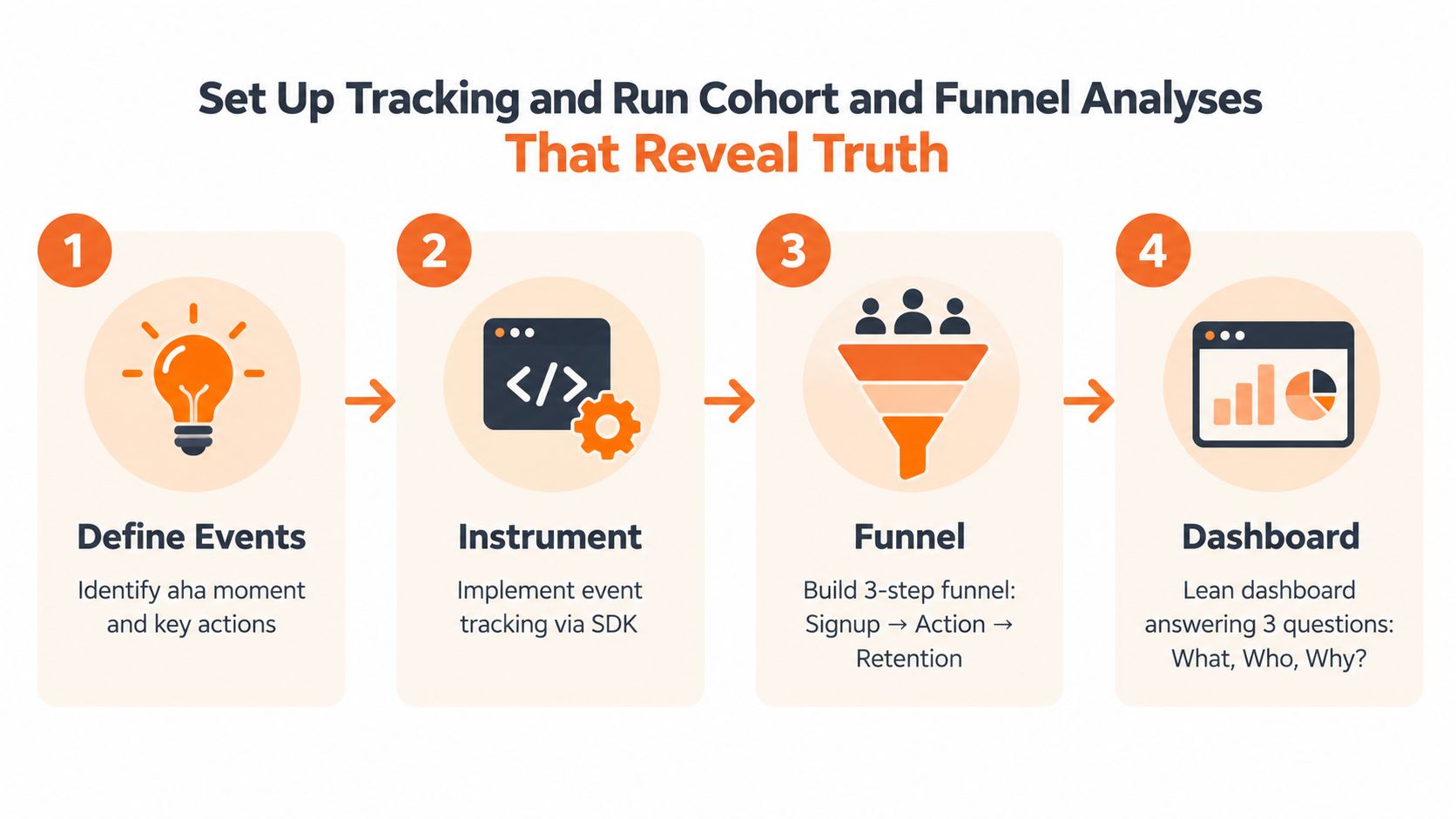
Good measurement begins with clean definitions. Before you connect an analytics tool, write down the events that matter, who can trigger them, and what each event proves.
For a workflow product, your event list might include account created, project started, core action completed, result accepted, and return visit. Keep the event names specific. “Button clicked” can help diagnose friction, but “invoice successfully sent” says more about value.
Instrument the aha moment
Your activation event should represent the first meaningful outcome. The activation formula is:
Activation rate = activated users ÷ total new users × 100
The product success metrics and KPI reference recommends measuring activation against a defined aha moment. Its examples include Slack reaching that moment when teams sent 2,000 messages, Dropbox when users uploaded a file, and Facebook when users added 7 friends in 10 days. Use those examples as prompts, not universal targets. Your aha moment should come from your own product promise and user behavior.
Create a funnel that answers three questions:
- Reach: Did eligible users encounter the product or feature?
- Action: Did they complete the first useful step?
- Return: Did they come back and repeat the behavior?
A lean dashboard can show the funnel by acquisition source, plan, persona, and signup cohort. For teams learning analytics from scratch, this Google Analytics guide for beginners can help with basic measurement concepts, though product events still need definitions that match your core workflow.
Read retention by cohort
Group users by a shared start point, then track what happens to each group. Fixed checkpoints make the analysis concrete. Common checkpoints include Day 1, Day 7, and Day 30, as described in this cohort retention and AARRR metrics guide.
The standard retention formula is:
Retention rate = users remaining at the end of a period ÷ users at the start of the period × 100
Compare cohorts by signup week, acquisition source, plan, onboarding path, or product version. A single overall retention number can hide a problem affecting only one channel or release.
Add sentiment without letting it lead
NPS calculates as:
NPS = percentage of Promoters minus percentage of Detractors
It asks how likely customers are to recommend the product, which makes it useful for tracking loyalty alongside usage and revenue, as explained in this customer engagement metrics guide. Use NPS to ask what users feel. Use funnel and cohort data to see what they do. The two signals can disagree, and that disagreement gives you an investigation to run.
For support patterns, onboarding ideas, and customer communication workflows, you can also review SupportGPT-1 blog insights. Keep the system lean. If an event doesn't answer a product question, don't instrument it yet.
Add Qualitative Feedback and Build a Weekly Measurement Cadence
Numbers tell you where the smoke is. Conversations help you find the fire.
When a core workflow underperforms, I want three views: the event data, a short user rating after the task, and a direct observation of someone trying to complete the flow. That combination prevents a common mistake, treating a low conversion step as proof of one specific cause.
Test the flows users actually need
For product-experience validation, test 3 to 5 critical flows with 12 to 20 users who match your target audience, using a documented rubric, as described in this usability measurement methodology. Measure task completion, time on task, SEQ, and error rate. A short SEQ survey after a task can capture perceived difficulty while the behavioral measures show what happened.
The SUM framework can normalize each measure against a benchmark or specification limit with Z-scores before combining the results into a usability score. You don't need to build that model for every small release. The practical lesson is simpler: define the task, record the result, and compare the same way each time.
Practical rule: Ask for feedback after the user reaches the intended result, not only after they click the starting button.
AI changes the meaning of usage. An automated product may complete work with fewer visible clicks, sessions, or screens. Track task completion, time saved, error reduction, and business impact alongside activation and median time to value, rather than treating interaction volume as the value itself, as discussed in this 2026 product management prediction.
Run a short weekly review
Use a fixed cadence that ends with decisions:
- Before the meeting: The owner updates the North Star, activation, retention cohort, and one current funnel.
- During the first part: The team identifies the largest change and checks whether the data definition stayed stable.
- During the middle: Review one user test, support pattern, or open-ended response beside the chart.
- Before closing: Choose one action, one owner, and one expected signal to watch.
Keep the meeting short enough that the team can repeat it. A review that produces no decision is a report. A review that changes an onboarding step, fixes an event, or schedules customer calls is product work.
Use a simple customer feedback collection guide to organize the qualitative side. Tag feedback by workflow, user type, and friction point. You don't need a research department to learn why users abandon a task. You need a repeatable question and a habit of listening.
Avoid Common Pitfalls and Use Templates to Keep Measurement Honest
The biggest measurement mistake is usually excess. Teams add dashboards until nobody knows which number deserves attention. Then they choose the metric that looks healthiest.
Start with this short audit:
- One North Star: Does it describe the product's core usage?
- One activation event: Can you name the first useful outcome?
- One retention view: Do cohorts show whether users return?
- One business connection: Can you explain how usage relates to revenue, churn, or expansion?
- One qualitative check: Do you know why users struggle or succeed?
NPS deserves a place in the system, but it shouldn't become the system. A high score can coexist with incomplete workflows, slow task completion, or frequent errors. Treat sentiment as a diagnostic layer, then verify it against behavior.
Dashboard template
Copy this structure:
| Block | What to show | Decision |
|---|---|---|
| North Star | Current product usage and trend | Are users receiving the core value? |
| Funnel | Acquisition, activation, core action, return | Where do users stop? |
| Cohorts | Retention by signup or plan group | Which users return? |
| Customer voice | SEQ, NPS, support themes, interview notes | Why does the pattern exist? |
| Business link | Conversion, churn, expansion, or revenue influenced by product | Does usage support the company? |
Weekly review template
Use four lines in your meeting notes:
- What changed?
- What evidence explains it?
- What decision will we make?
- Who owns the next check?
Revisit your North Star when the product changes. If users now receive value through automation, a click-based measure may no longer represent the work completed. If the product expands into a new workflow, your original metric may describe only one slice of customer value.
For founder peer support around product decisions, traction, and operating discipline, Chicago Brandstarters is a free community where members meet in private small-group dinners and share practical business challenges. Visit Chicago Brandstarters to learn how the community can help you test assumptions, review your metrics, and keep building with people who value kindness and hard work.
Leave a Reply